Crosstab Report Editor - Properties Pane
The following list of properties pertain to objects added to a crosstab report. The Applies To column indicates which object types have that property. Many of these properties can be modified using the available toolbar options (for example, font colors and sizes). The Properties pane gives you a way to modify some of the properties that are not otherwise available to you.
Measurement properties (such as those that add space to a row or column, etc.) the units are determined by the current units in the design page. Double click the displayed unit to cycle through the available options.
Note that properties supported for text objects also apply to individual cell types of a crosstab. Within a crosstab, the text property can usually be set independently for each type of cell (row heading, column heading, and body cells) in the table.
| Property | Applies To | Description |
|---|---|---|
| Add Height | Crosstab | Adds the specified vertical spacing to each data row in the crosstab. Units determined by the current unit selection. (Automatic sizing must be turned on.) |
| Add Width | Crosstab | Adds the specified horizontal spacing to each data row in the crosstab. Units determined by the current unit selection. (Automatic sizing must be turned on.) |
| Align | Crosstab, Text | Specifies the alignment of the selected object (crosstab table or text box) relative to a parent band or a page. |
| Allow Duplicates | Crosstab | Controls whether or not the cell accepts duplicate string values. |
|
Anchors > Left, Top, Right, or Bottom |
Crosstab, Text | Set the respective Anchor to True to fix the position of that edge relative to a parent object's size. When a parent object changes size, an anchored child object will be moved or resized to maintain the same distance from the anchored edge(s). This is useful for text objects that are placed inside a band. |
| Auto Size | Crosstab | True automatically sizes the table to fit the content. False retains the size specified on the Crosstab Report Editor page. |
| Auto Width | Text | True automatically sets the width of the text object or table cell to fit the content. False retains the width specified on the Crosstab Report Editor page. |
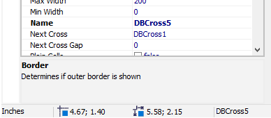
| Border | Crosstab | True applies a border to the crosstab. |
| Bottom Margin | Page | Sets the bottom margin of the page (in inches, centimeters, or pixels, as selected). |
| Can Shrink | Text | When True, this reduces the size of the text object when other objects on the page need additional space. |
| Cell Fields | Crosstab | Not used. |
| Cell Levels | Crosstab | Not used. |
| Color | Text | Allows selection of a background color by displaying a list of built-in colors as well as a tool for selecting custom colors. |
| Column Fields | Crosstab | Not used. |
| Column Levels | Crosstab | Not used. |
| Columns | Page | Used to draw equally-spaced column separators on the page that can be used as guides for placement of other objects. These columns are not visible when the report is rendered. |
| Cursor | Text | Selects the cursor to display when the mouse hovers over the object in preview mode. |
| Data Field | Text | When a dataset is selected, this provides a list of the available data fields for a database text object. |
| Dataset | Crosstab, Text | Selects the dataset currently in use for the crosstab or for the database text. |
| Def Height | Crosstab | Sets the default height of each row in the crosstab, in pixels. Use 0 to automatically size the crosstab when it is rendered. |
| Description | Crosstab, Text, Bands | A description of the object (optional). |
| Display Format | Text | Specifies the data format for the text object (text, number, or date/time), the decimal separator character, and allows entry of a custom format string. |
|
Display Format > Decimal Separator Format Str Kind Display Thousand Separator |
Text | Specifies the following:
|
| Down Then Across | Crosstab | Specifies how large crosstabs are split across pages. |
| Duplicates | Text | Specifies how duplicates in adjacent cells are displayed (Clear, Hide, Merge, or Show). |
| Fill | Text | Displays a dialog that allows you to set the style and colors for an optional fill pattern used for a text object. |
| Fill > Back Color Fore Color Style |
Text, Bands | These properties control the individual style and color settings for the fill pattern. |
| Font | Text, Bands, Page | Specifies the object's font attributes. When you edit the top-level font property, you can use the familiar font selection dialog to set the font, style, size, color, and other available options. |
| Font > Charset Color Name Quality Size Style |
Text, Bands, Page | These properties control the individual style, color, and other settings for the font.
|
| Frame | Text, Bands, Page, Crosstab | Frame properties set the border characteristics for the selected object.
|
| Frame > Bottom Line Left Line Right Line Top Line |
Text, Bands, Page, Crosstab | Expand the Bottom, Left, Right, or Top Line property to display controls for the respective line. You can set the color, style, and width of each line individually. These settings default to the setting of the Frame itself, but can be changed individually. |
| Frame > Color | Text, Bands, Page, Crosstab | Specifies the default color for the frame (border) around the object. |
| Frame > Drop Shadow | Text, Bands, Page, Crosstab | True adds a drop shadow to the object's frame. |
| Frame > Shadow Color | Text, Bands, Page, Crosstab | Allows selection of the drop shadow color by displaying a list of built-in colors as well as an available custom-color tool. This has no effect if Drop Shadow is not enabled. |
| Frame > Shadow Width | Text, Bands, Page, Crosstab | Specifies the width of the drop shadow. This has no effect if Drop Shadow is not enabled. |
| Frame > Style | Text, Bands, Page, Crosstab | Specifies the default style of the line used for the frame. |
| Frame > Width | Text, Bands, Page, Crosstab | Specifies the default width of the line used for the frame. |
| Frame > Type | Text, Bands, Page, Crosstab | Controls the display of frame borders. Expand the Typ property to add or remove individual frame borders. True adds the border, False removes it. |
| Gap X | Crosstab, Text | Specifies the left indent for the text in a cell (in pixels). |
| Gap Y | Crosstab, Text | Specifies the top indent for the text in a cell (in pixels). |
| Height | Text, Crosstab, Bands | The height of the object (in inches, centimeters, or pixels, as selected).
|
| Hide Zeros | Text | Controls whether or not zero values will be hidden. This is primarily useful in crosstab cells. A setting of True hides zero values. |
| Highlight | Text | Specifies the characteristics of highlighting used for the object in the rendered report. |
| Highlight > Apply Fill | Text | Enables or disables highlighting on the selected text. |
| Highlight > Apply Font | Text | Enables or disables the use of a specific highlighting font for highlighted text. |
| Highlight > Apply Frame | Text | Enables or disables the use of a frame around the highlighted text. |
| Highlight > Color | Text | Allows selection of a highlight color by displaying a list of built-in colors as well as an available custom-color tool. |
| Highlight > Condition | Text | Specifies the condition under which highlighting is applied. Use the Conditional Formatting button  in the toolbar to display the Condition dialog and edit the condition settings. in the toolbar to display the Condition dialog and edit the condition settings. |
| Highlight > Fill | Text | Displays a dialog that allows you to set the style and colors for an optional fill pattern used for the highlighting. |
| Highlight > Fill > Back Color Fill > Fore Color Fill > Style |
Text | These properties control the individual style and color settings for the fill pattern used for the highlighting. |
| Highlight > Font | Text | Displays a dialog that allows you to set the font and font characteristics for the highlighted text. |
| Highlight > Font > Charset Font > Color Font > Name Font > Orientation Font > Quality Font > Size Font > Style |
Text | These properties control the appearance of the text by setting each property separately.
|
| Highlight > Frame | Text | Displays a dialog that you can use to customize the appearance of the frame (border) around the highlighted area. You can also expand the Frame property to display the individual properties that you can set. |
| Highlight > Frame > Bottom Line Frame > Left Line Frame > Right Line Frame > Top Line |
Text | Expand the Bottom, Left, Right, or Top Line property to display controls for the respective line. You can set the color, style, and width of each line individually. These settings default to the setting of the Highlight Frame itself, but can be changed individually. |
| Highlight > Frame > Color | Text | Specifies the default color for the highlight frame (border) around the object. |
| Highlight > Frame > Drop Shadow | Text | True adds a drop shadow to the highlight frame. |
| Highlight > Frame > Shadow Color | Text | Allows selection of the drop shadow color by displaying a list of built-in colors as well as an available custom-color tool. This has no effect if Drop Shadow is not enabled. |
| Highlight > Frame > Shadow Width | Text | Specifies the width of the drop shadow (in pixels). This has no effect if Drop Shadow is not enabled. |
| Highlight > Frame > Style | Text | Selects the line style to use for the highlight frame. |
| Highlight > Frame > Typ | Text | The Typ properties control display of the individual highlight frame borders. Expand the Typ property to add or remove individual frame borders. True adds the border, False removes it. |
| Highlight > Frame > Typ > Left Typ > Right Typ > Top Typ > Bottom |
Text | True displays the selected border, False hides the border. |
| Highlight > Frame > Width | Text | Specifies the width of the highlight frame border (in pixels). |
| Highlight > Interactive Type | Text | Not used. |
| Highlight > Visible | Text | True allows the highlight to be displayed, as configured with the other highlight properties. False hides the data in the cell when the condition for highlighting is met. |
| Horizontal Align | Text | Specifies the horizontal alignment of the text within the text box (Block, Left, Right, or Center). |
| Index Tag | bands | Not used. |
| Join Equal Cells | Crosstab | True causes cells with equal values to be joined within the crosstab. |
| Keep Rows Together | Crosstab | True keeps the rows of a crosstab together when the report is rendered. |
| Keep Together | Crosstab | True keeps a band together with all its subbands when the report is rendered. |
| Left | Crosstab, Text, Bands | Specifies the left offset of the object (in inches, centimeters, or pixels, as selected). |
| Left Margin | Page | Specifies the left margin of the page (in inches, centimeters, or pixels, as selected). |
| Max Width | Crosstab | Specifies the maximum column width for the crosstab object (in pixels). |
| Min Width | Crosstab | Specifies the minimum width of the crosstab object (in pixels). |
| Name | Crosstab, Text, Bands, Page | Specifies the name of the object.
|
| Next Cross | Crosstab | Specifies the next crosstab, when there are multiple crosstabs in the report and they are to be placed side by side horizontally. |
| Next Cross Gap | Crosstab | Specifies the gap between adjacent (side by side) crosstabs. |
| Orientation | Page | Specifies the orientation of the page (Landscape or Portrait). |
| Page Count | Page | Limits the number of pages rendered for a preview. |
| Paper Size | Page | Specifies the paper size for the report. Select the appropriate paper size from the list provided. |
| Parent Font | Text, Bands | True causes the object to use the parent object's font. |
| Plain Cells | Crosstab | This setting controls how values in the cell of a crosstab are displayed when a cell in the crosstab contains more than one data value.
|
| Printable | Crosstab, Text | Controls whether or not the object will be printed. False allows the object to be displayed in a preview, but not printed. |
| Print If Empty | Page | Controls whether or not the page will be printed when all datasets on the page are empty. True allows the print to continue for empty reports. |
| Print On First Page | Page Header Band, Page Footer Band | True includes the selected header or footer band on the first page of the printed report. False prevents the band from printing on the first page. |
| Print On Last Page | Page Footer Band | True includes the footer band on the last page of the printed report. False prevents the band from printing on the last page. |
| Repeat Headers | Crosstab | Controls whether header bands will be displayed on all pages of the report. |
| Right Margin | Page | Sets the right margin of the page (in inches, centimeters, or pixels, as selected). |
| Rotation | Text | Specifies the rotation (counter clockwise) of the text, in degrees. |
| Row Fields | Crosstab | Not used. |
| RTL Reading | Text | True enables right-to-left reading mode for text in the rendered report. |
| Row Levels | Crosstab | Not used. |
| Show Column Header | Crosstab | Controls whether or not the column headers display on the crosstab. True includes the header for both print and preview. |
| Show Column Total | Crosstab | Controls whether or not the column total displays on the crosstab. True includes the total for both print and preview. |
| Show Corner | Crosstab | Controls whether or not the corner cell displays on the crosstab. True includes the corner cell for both print and preview. |
| Show Row Header | Crosstab | Controls whether or not the row headers display on the crosstab. True includes the header for both print and preview. |
| Show Row Total | Crosstab | Controls whether or not the row totals display on the crosstab. True includes the totals for both print and preview. |
| Show Title | Crosstab | Controls whether or not the title displays on the crosstab. True includes the title for both print and preview. |
| Stretched | Report Title Band, Page Header Band | Controls whether the text in the object can be expanded. |
| Stretch Mode | Text | Specifies how the text can be stretched (Actual Height, Don't Stretch, or Max Height). |
| Suppress Null Records | Crosstab | Controls whether or not null records are suppressed in the crosstab. True suppresses the null records. |
| Suppress Repeated | Text | Controls whether or not repeated values are suppressed in the text. True suppresses the repeated values. |
| Tag | Crosstab, Text, Bands | Not used. |
| Top | Crosstab, Text, Bands | Specifies the top offset of the object (in inches, centimeters, or pixels, as selected). |
| Top Margin | Page | Sets the top margin of the page (in inches, centimeters, or pixels, as selected). |
| Vertical Align | Text | Specifies the vertical alignment of the text within the text box (Top, Bottom, or Center). |
| Visibility | Crosstab, Text | Displays the current setting for visibility of the object (visible in Preview, Export, and/or Print). Expand the property to control the individual visibility settings. |
| Visibility > Preview Export |
Crosstab, Text | True makes the object visible for the specified output mode. False hides the object in that mode. Note that the Visible property, when set to False, overrides the Visibility settings. |
| Visible | Crosstab, Text, Bands | True makes the object visible for printing, export, and in preview mode. When set to False, the object is not visible in any output. For more granular control, use the more specific Visibility settings, above. |
| Width | Crosstab, Text, Bands | Controls the width of the object (in inches, centimeters, or pixels, as selected). Note that Auto Size must be set to False if you want to control the width with this setting. |
| Word Wrap | Text | Specifies whether or not text in the text box will wrap. False prevents the text from wrapping which may result in some data not being visible. |